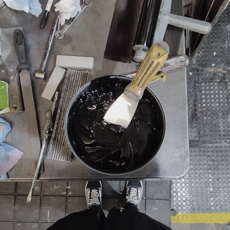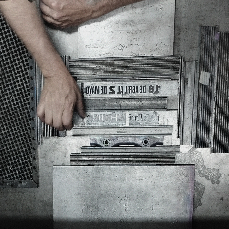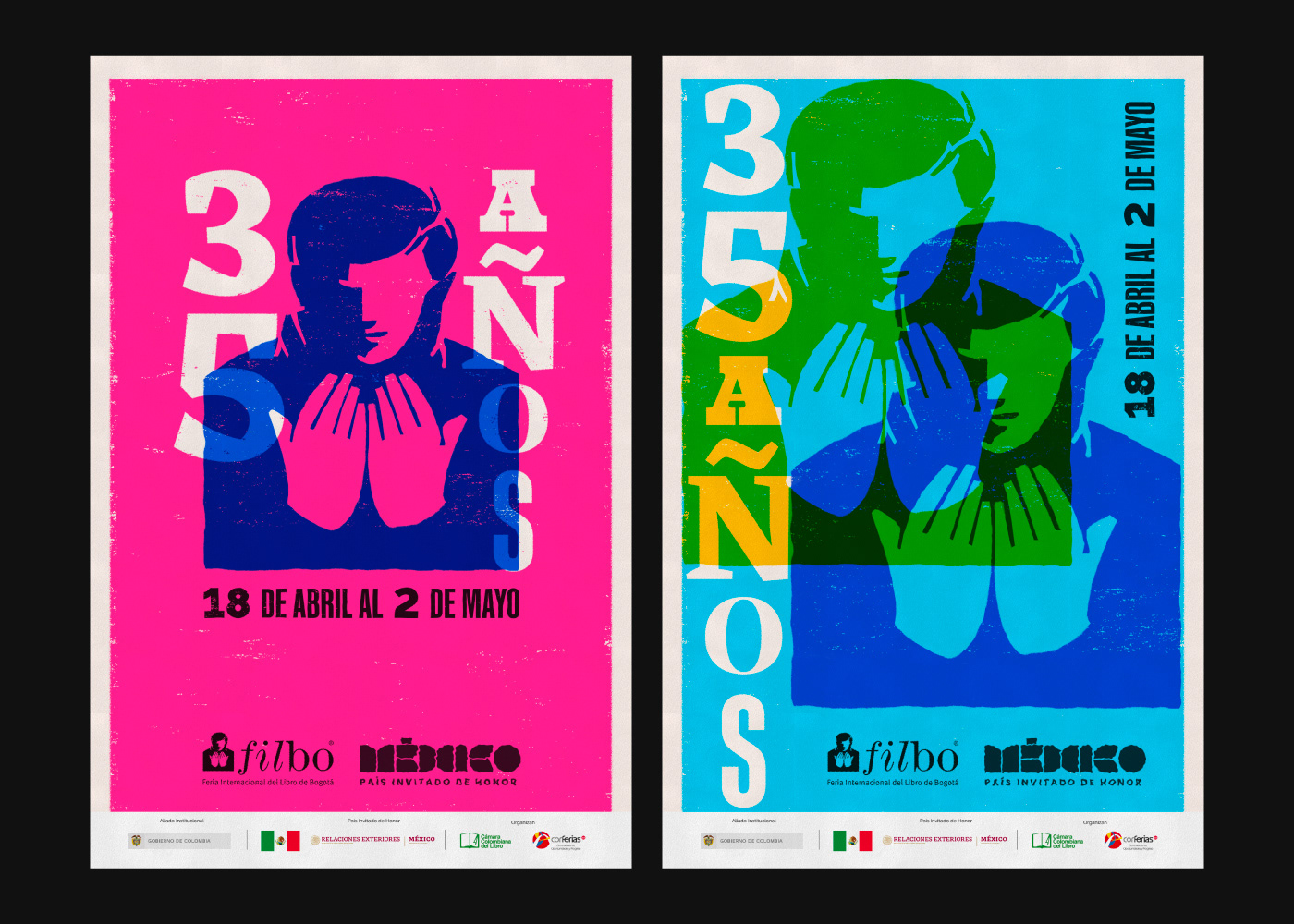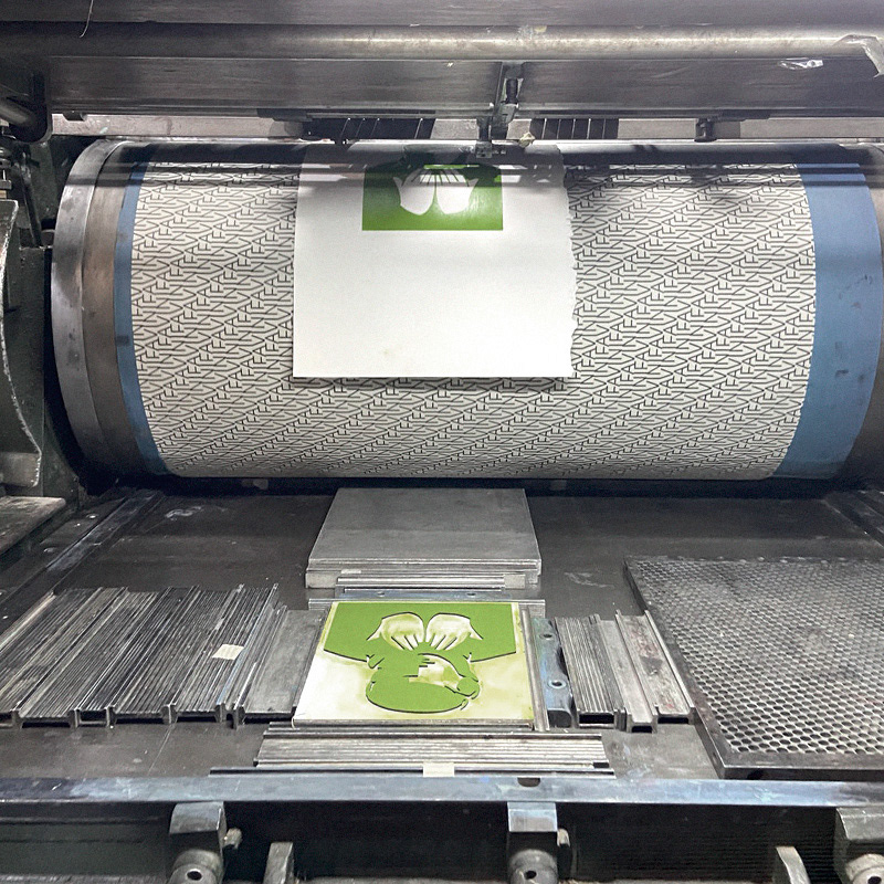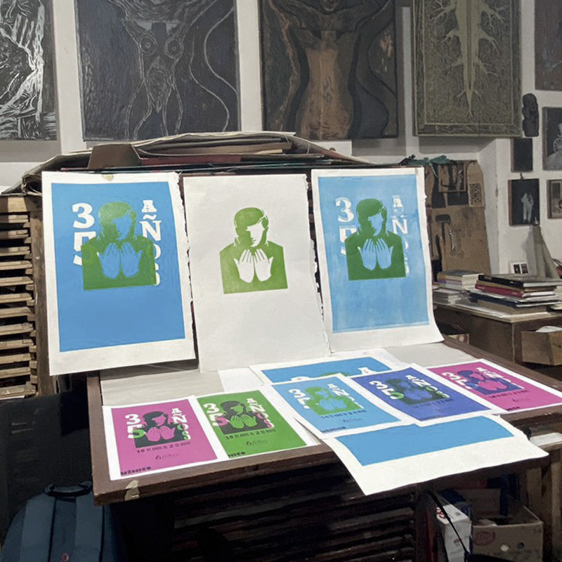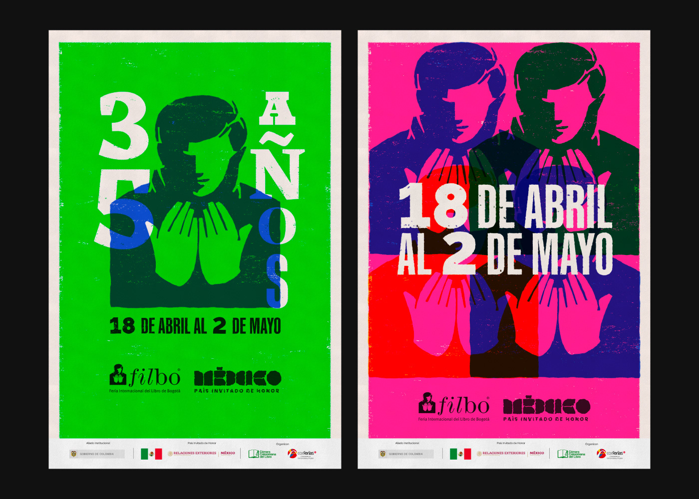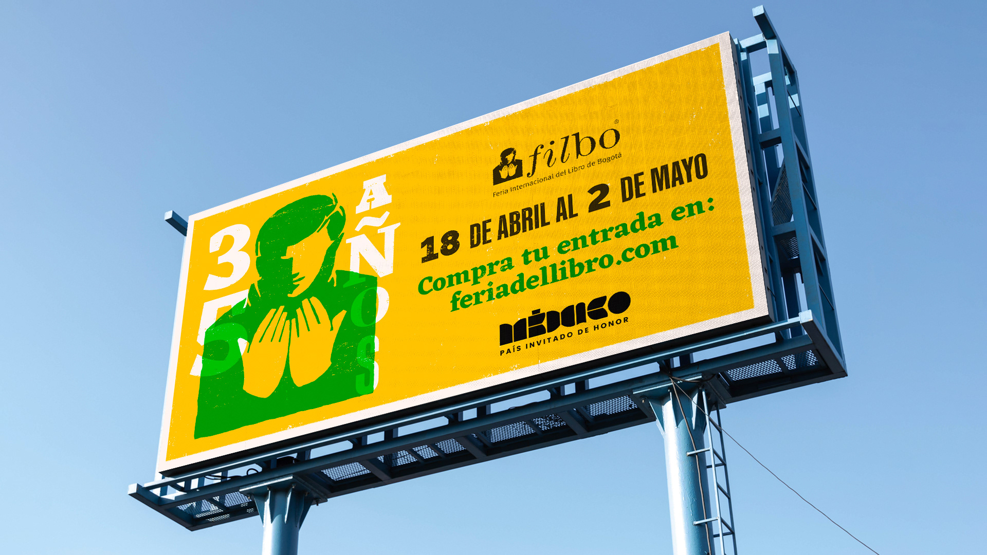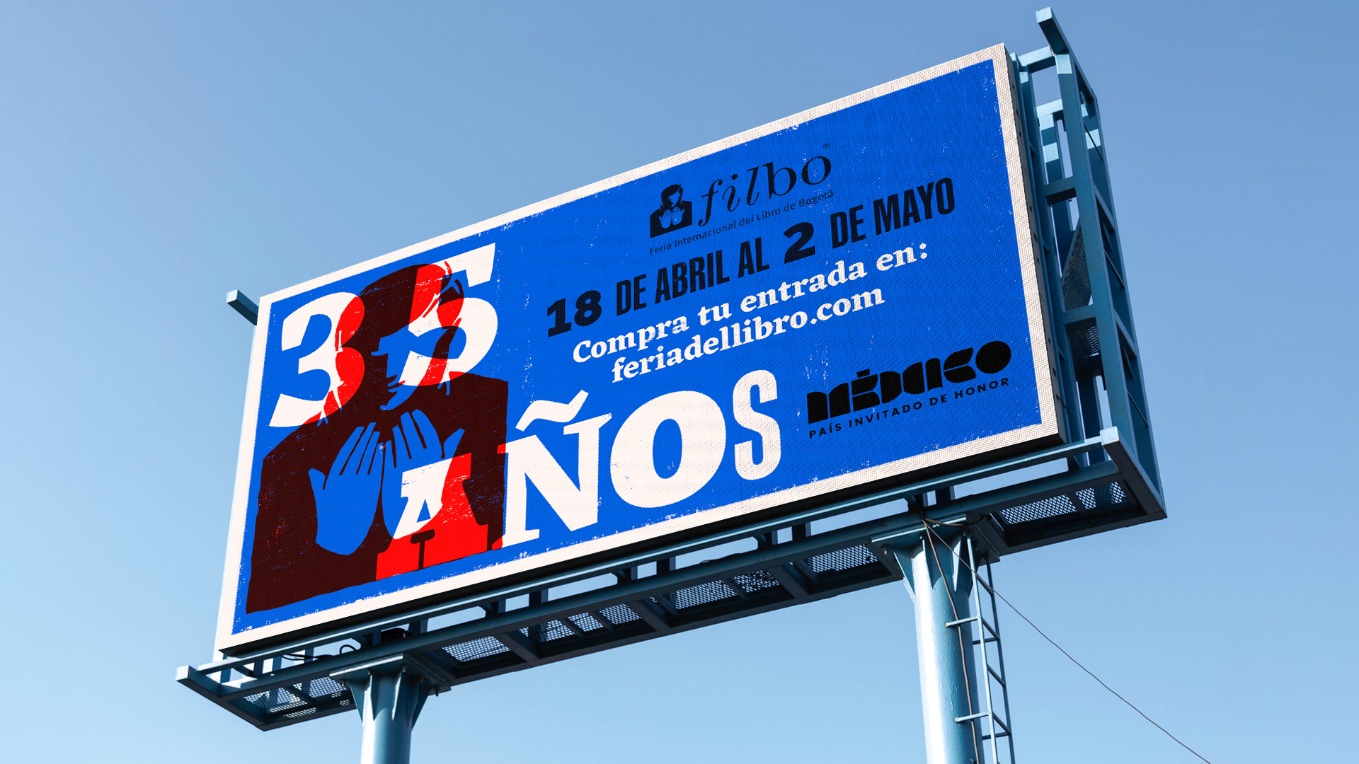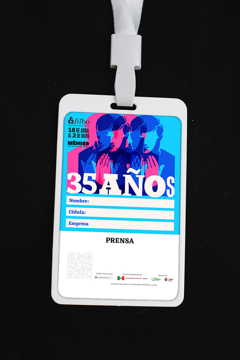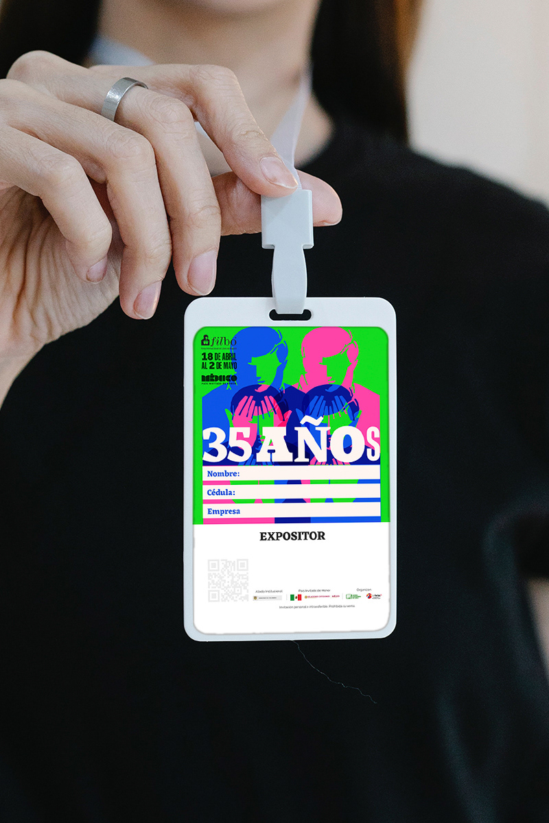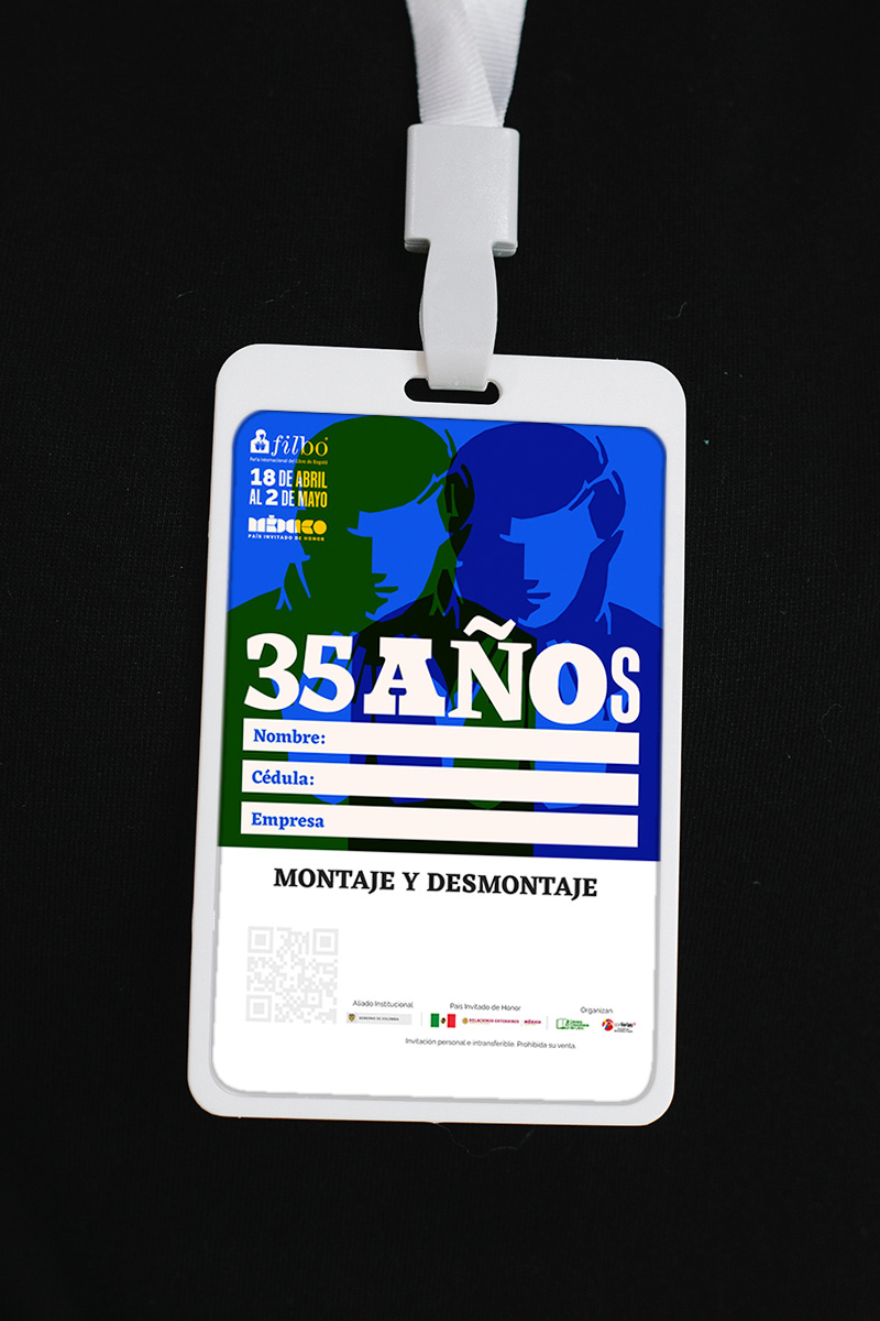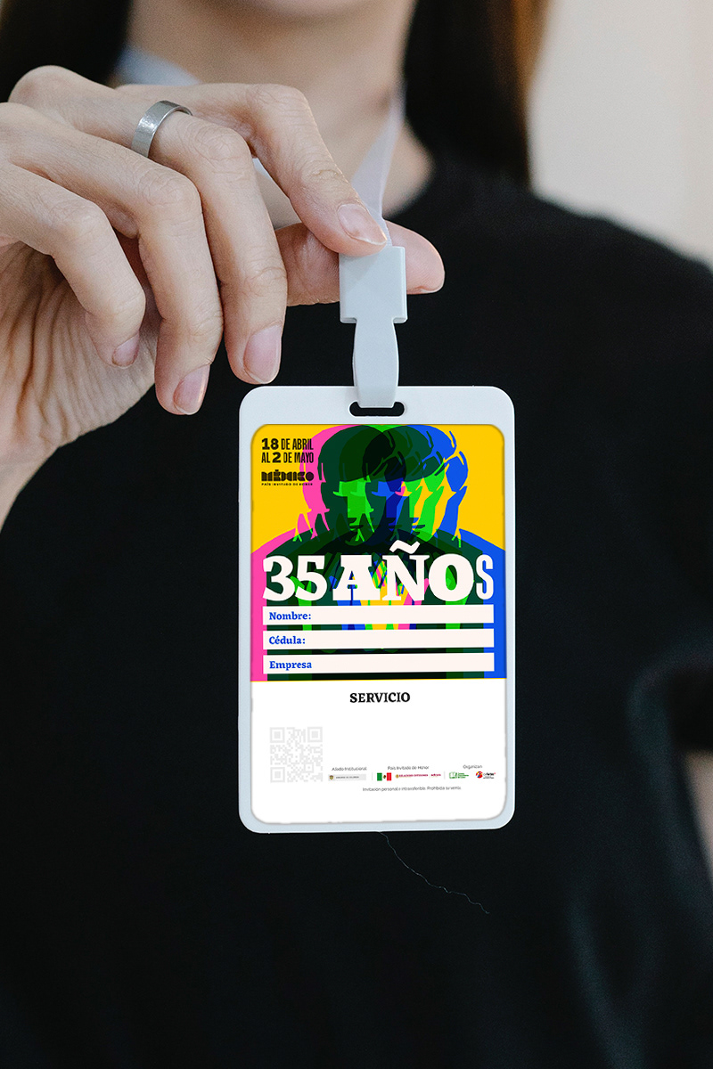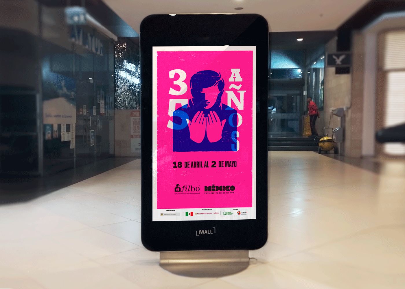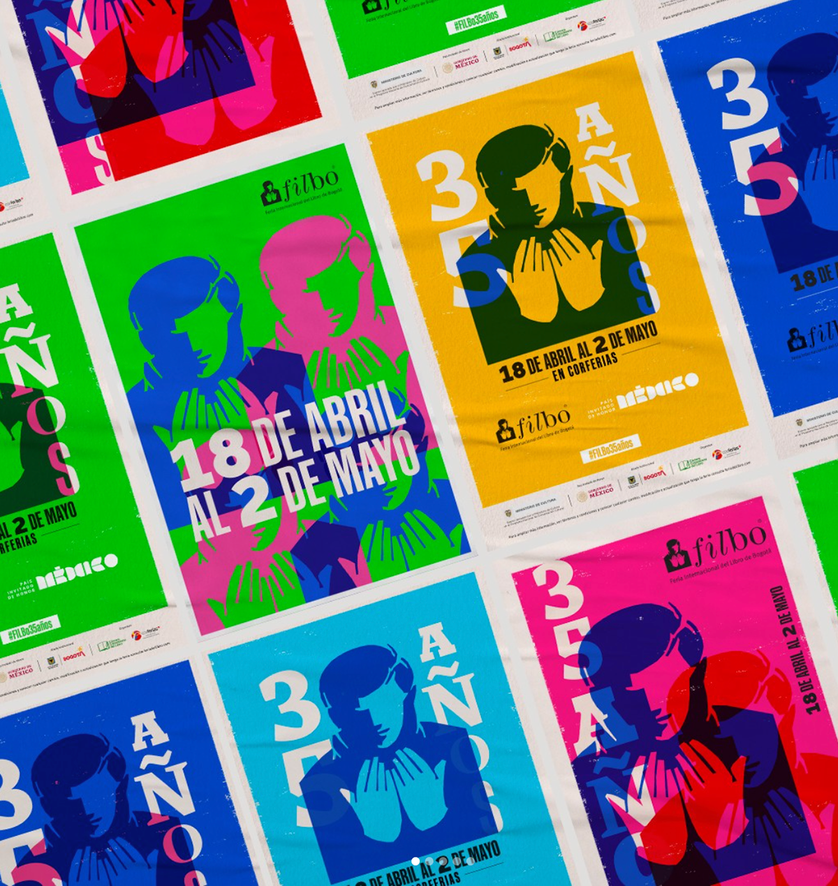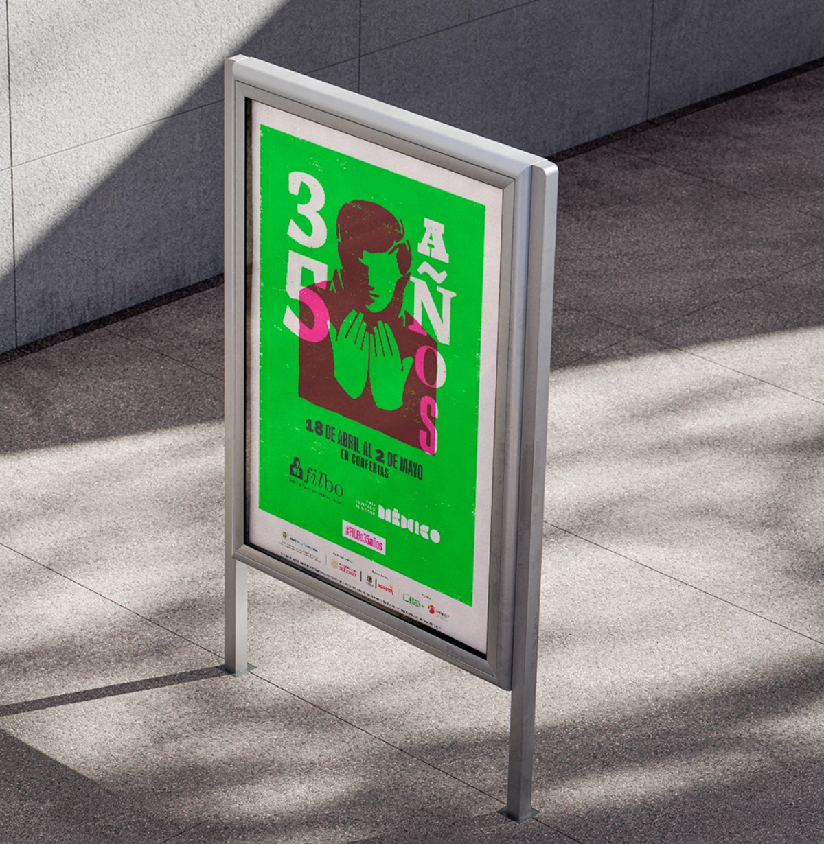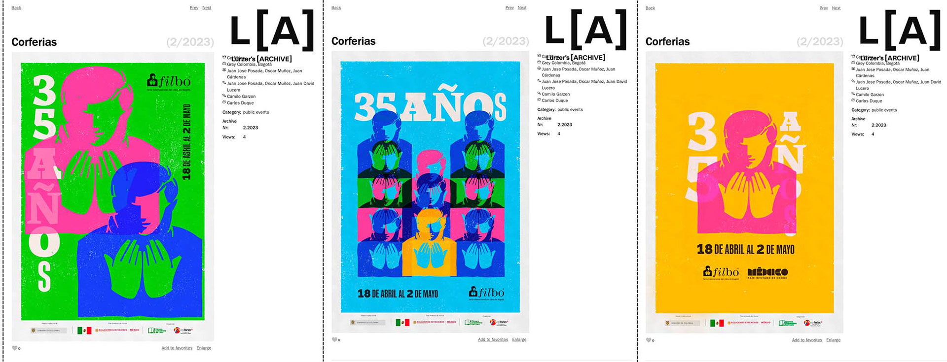
We transformed the mobile fonts along with the iconic reader logo into a modular medium to create our campaign for the Bogotá International Book Fair, where by varying their size, thickness, and color, we conveyed the essence of the fair's roots, expressing the 35 years of this mega event in Colombia, where each typography became stories, fables, histories, and documentaries.